Website Re-design: Fragrantica
The Why
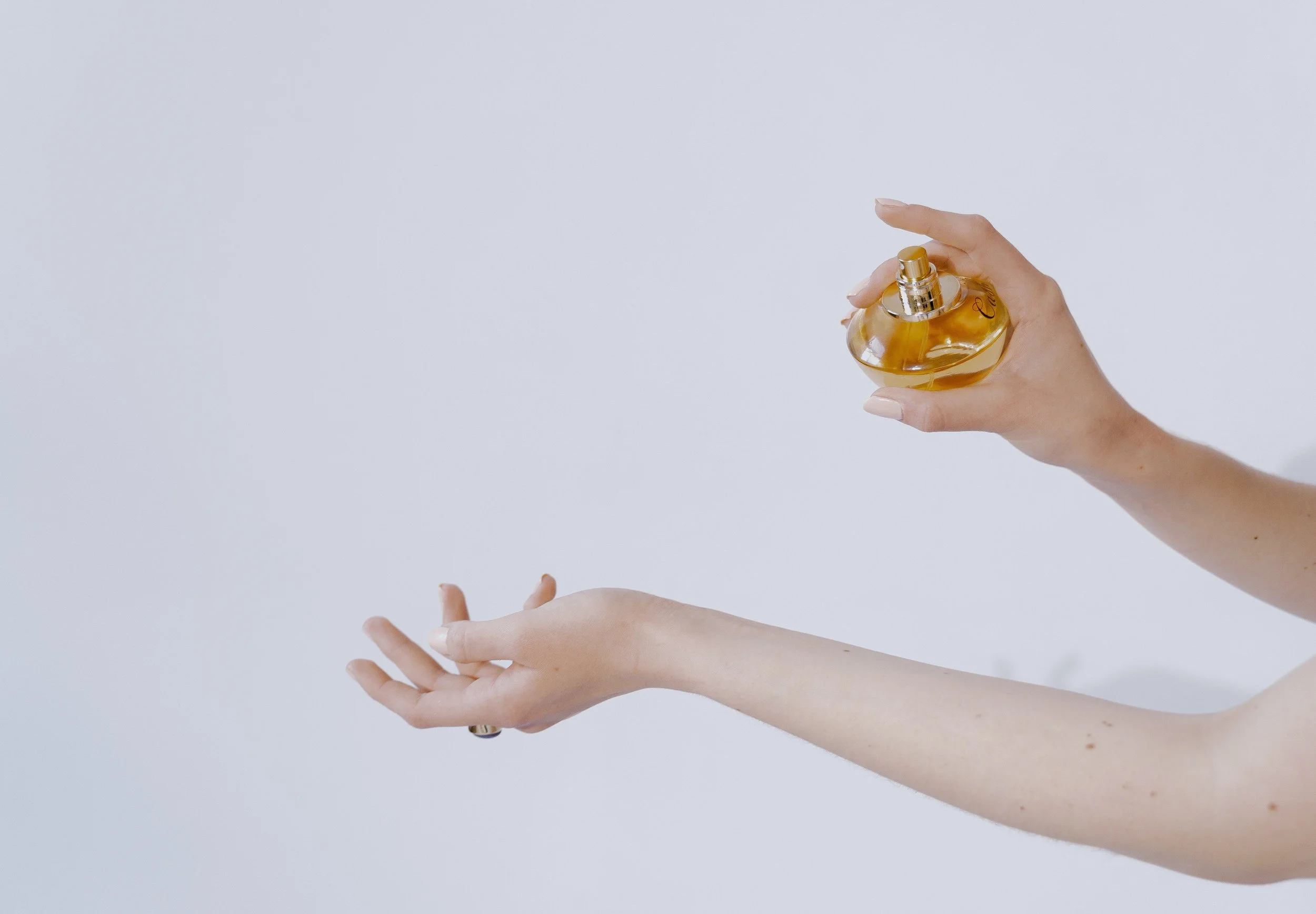
During one of my many deep dives into #fragrancetok on TikTok, I learned about the website called Fragrantica. Many beauty and fragrance gurus flock to Fragrantica to search through their encyclopedia of perfumes to reference the scent notes, find similar fragrances, discover new releases, and more. However, upon perusing it from my iPhone, I was quickly put-off with the user experience. It was not responsive, slow to load, confusing to navigate, and has an overall outdated visual design.
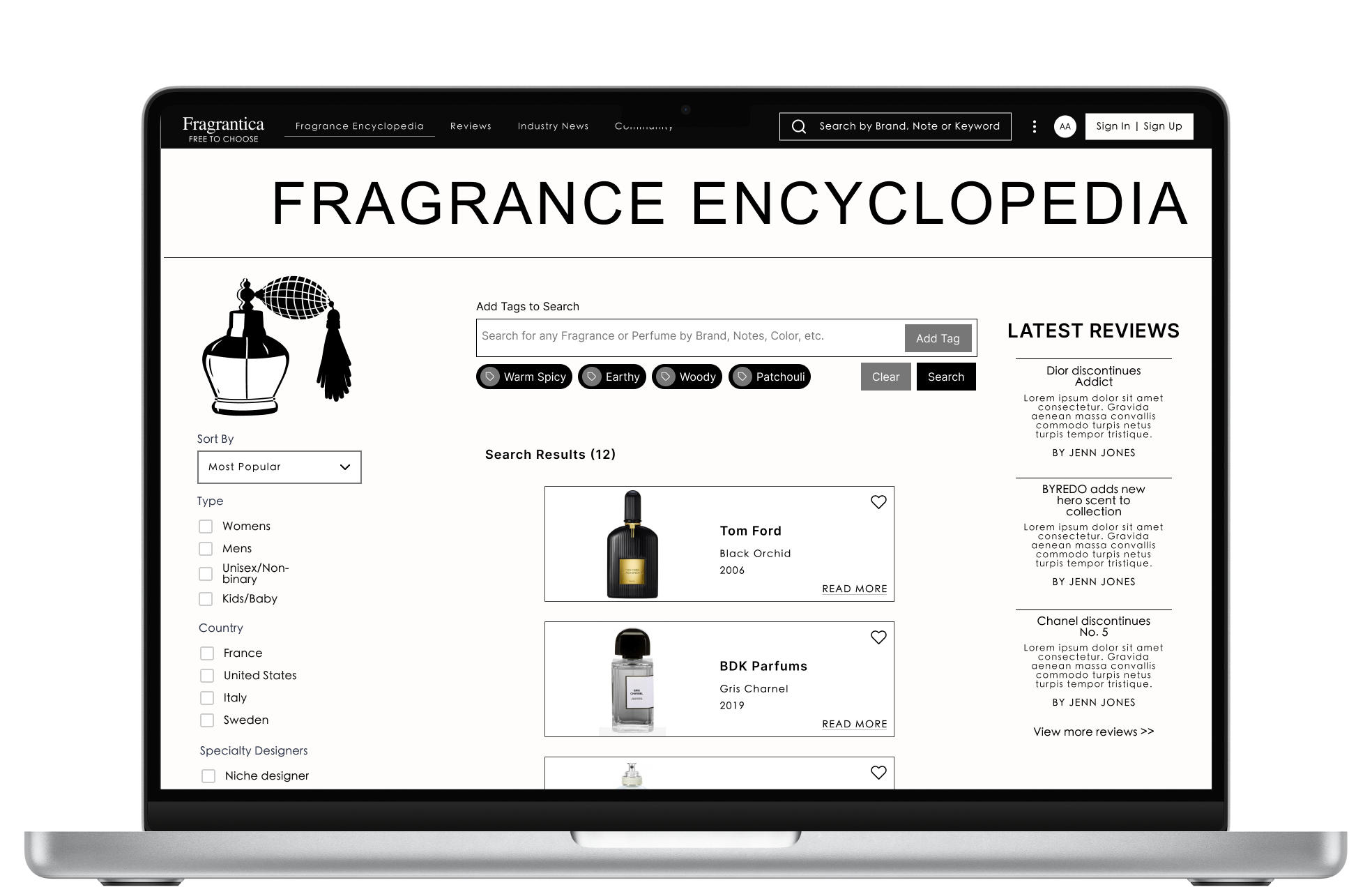
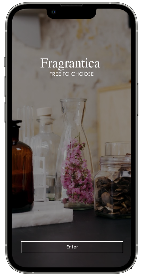
Current Version
Less is more
Beginning with the encyclopedia feature of the site and pairing down the variety of search options currently available, my re-design offers a minimalistic approach to the navigation and aesthetic. Since many perfume bottles or their labels are colorful, the re-design allows for the bottles to stand out better and be the focal point of the page.
What’s next?
Design additions or edits I’d like to make in the future
*Disclaimer: this re-design project has been developed with a creative purpose. All materials used are in a non-commercial basis.
Make search bars and input sections interactive
Remove the background from perfume JPEGs to blend in with the background color
Once that’s done, change the background to a darker neutral for contrast and visual appeal, something along the lines of the beige tones seen throughout this portfolio
Fix breakpoints and off-centered frames